

Newcastle United are to consult with their supporters on “refining and reviving” their current club crest.
The club have launched a consultation process with fans via an independently run survey aimed at seeking advice on how they can modernise their badge.
After initial discussions with Newcastle’s Fan Advisory Board (FAB), the club have accepted that there is little hunger for a major overhaul of the crest’s design, which has been in use and largely unchanged since 1988.
Advertisement
It is perhaps most synonymous — at least until earlier this season, when the club finally ended their long wait for a meaningful trophy — with Kevin Keegan’s Entertainers team of the mid 1990s and it is based on the city’s coat of arms, featuring the castle and seahorses which pay tribute to the city’s status as a seaport.
“This isn’t about walking away from our past,” the club said in an official statement on Friday. “It’s about carrying it forward with pride. The crest is part of our story. It’s on our shirts and inked in our skin. It deserves thoughtful evolution — shaped by the voices of the people who love it … Based on what we’ve heard, updates to the current club crest should be minimal and therefore ‘Refine & Revive ’ is our recommended approach.”
At issue is the fine detail of the club’s current design. “It was created in a different era,” the club said. “Its intricate design doesn’t always translate well in today’s digital world. And it’s difficult to reproduce it clearly and consistently. As football and the world changes, so too must the symbol that unites us.”
Initially, Newcastle season ticket holders and members will be given until May 16 to respond to a survey about what should be retained or updated from the current badge, the results of which will be collected by Savanta and then passed on to the club.
The FAB have then recommended that Newcastle’s wider fanbase should be given a choice of options in the second stage of the consultation process. No potential changes to the badge will be made in time for the start of next season.
Fan consultation key to process
As someone who is old enough to remember previous incarnations of Newcastle’s club crest, I’m perhaps not as emotionally wedded to the current version as some might be.
Don’t get me wrong, this is a classic badge, one which celebrates the club’s connection to the city and which stretches back into Newcastle’s proud history, but other designs have been just as beautiful.
Advertisement
What about the magpie standing splendid beneath the arc of a downturned capital letter C, which props up a curled NUF? That was gorgeous, something I’ll forever associate with Paul Gascoigne, the first player who persuaded me that football could be poetic (as well as brutal).
Those simple, sensuous curves – which were on the front of Newcastle kits from 1983-88 – were ahead of their time; think about Juventus and the decision they took in 2017 to strip their badge back to their first initial. I wouldn’t have minded a comeback for that design.
The magpie makes sense for Newcastle, the club – more so than the seahorses on the city crest, which are a nod to the city being a seaport – because that is their nickname. It also featured prominently on a club badge from 1976-83, standing in front of the Castle Keep and with the River Tyne in the foreground.
I’m pleased – and relieved – that Newcastle are consulting so heavily and sensitively with their supporters on “refining” their current crest and that they accept the link to the city is so important, but was there an argument to be more adventurous now that their modern identity has changed? After lifting the Carabao Cup, they are no longer the perennial losers. The magpies are rampant.
By nature, I’m a traditionalist, but losing was one tradition I was happy to let go of.
(Photo: Stu Forster/Getty Images)
This news was originally published on this post .
About the author

Mariners’ Julio Rodríguez makes highlight grab, robs homer from Trent Grisham
SEATTLE — It wasn’t happening this time.Seattle Mariners center fielder Julio Rodríguez robbed New York Yankees leadoff hitter Trent Grisham of a home run with a spectacular over-the-wall catch to start the game at T-Mobile Park on Wednesday.Rodríguez jumped when he reached the left-center field wall and reached well over it before making the snag.There was a moment of confusion. Rodríguez came down and didn’t immediately show the ball, so Grisham rounded second base and headed toward third like it was a home run. Then Rodríguez pumped his fist and threw the ball back into the infield. ARE YOU KIDDING @JRODshow44 🤯 pic.twitter.com/rNPZYnP9kg — Seattle Mariners (@Mariners) May 14, 2025It came against Luis Castillo’s 95.7 mph fastball in a 2-2 count.Grisham hit a pair of home runs over Rodríguez’s head in Game 1 of the series on Monday. One of […]
Seleção brasileira fará um amistoso contra o Real Madrid no segundo semestre
Treinador voltou a comentar boatos de saída do Real Madrid (Foto: Divulgação/Real Madrid) Carlo Ancelotti saiu do Real Madrid para assumir a seleção brasileira, mas a relação entre os três pode gerar algo um tanto quanto ‘inusitado’ para os dias atuais do futebol mundial. Neste caso, um jogo amistoso entre as duas equipes Amistoso à vista De acordo com Lauro Jardim, do jornal O Globo, já há um acerto para que Brasil e Real façam uma partida, ainda sem data ou local confirmado. A intenção do encontro seria uma espécie de ‘homenagem’ ao italiano e uma ‘despedida simbólica’ deste dos merengues, ao quais comandou até o começo da última semana, PUBLICIDADE PUBLICIDADE Diego Fernandes é quem está conduzindo as conversas para a realização da partida. O empresário foi quem comandou todo o processo de conversas que levou à contratação de […]
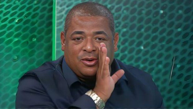
Rizek crava eliminação de brasileiro na fase de grupos do Mundial de Clubes da Fifa: “Chances mínimas”
André Rizek, apresentador do SporTV André Rizek trouxe as perspectivas para as equipes do Brasil no Mundial de Clubes, que será chamado de Copa do Mundo de Clubes da Fifa. A competição terá início daqui a exatamente um mês, em 14 de junho e vai até 13 de julho. Em vídeo para o ge.globo, o apresentador do Grupo Globo trouxe as reais condições de cada um dos quatro times do Brasileirão Série A que representarão o país no torneio. PUBLICIDADE PUBLICIDADE Inicialmente, André Rizek excluiu Flamengo, Palmeiras, Botafogo e Fluminense de qualquer possibilidade do cobiçado título, justificando que apenas o Verdão e o São Paulo estão em situações confortáveis na Libertadores. “É de se projetar um Mundial de Clubes complicado para o futebol brasileiro”, alertou o comentarista, complementando que os brasileiros não conseguem sobrar na Libertadores e na Copa Sul-Americana. […]
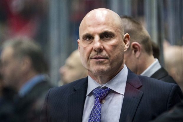
Flyers hire former player Rick Tocchet as coach
Jan 25, 2025; Vancouver, British Columbia, CAN; Vancouver Canucks head coach Rick Tocchet looks on from the bench against the Washington Capitals in the second period at Rogers Arena. Mandatory Credit: Bob Frid-Imagn Images The Philadelphia Flyers on Wednesday announced the hiring of Rick Tocchet as their new head coach. Tocchet, 61, spent parts of 11 seasons with the Flyers during his playing career. Now, he rejoins the franchise to effectively replace John Tortorella, who was fired in March with the team limping toward its fifth straight season without a playoff berth. Brad Shaw took over as the interim coach of the Flyers, who finished tied for last place in the Eastern Conference with a 33-39-10 record (76 points). "I am very happy to welcome Rick Tocchet as our head coach," Flyers general manager Daniel Briere said in a release. […]
Vampeta sinaliza clube que está perdendo protagonismo no Brasil: “Vem a pressão”
Vampeta avalia o futebol brasileiro. Foto: Reprodução/Jovem Pan Oscilando no Brasileirão Série A e perto da zona de rebaixamento, o SPFC tem como principal mérito a boa campanha na Copa Libertadores da América. Vampeta avaliou o momento do time e sinalizou sobre as deficiências no elenco. “É um plantel que não é tão grande. Zubeldía utiliza muitos jogadores da base, dando oportunidades. O São Paulo não vive um grande momento financeiramente… Vem a pressão em Zubeldía. Está perto da zona de rebaixamento no Brasileirão, o calendário é longo e sem o plantel completo. Está se virando com o que pode”, analisou o comentarista. PUBLICIDADE PUBLICIDADE Vampeta informa sobre Lucas Moura O time do MorumBIS vem sofrendo com desfalques neste ano. Calleri está fora da temporada e Lucas Moura, com dores no joelho atualmente, engrenou uma sequência de problemas físicos em […]
PGA Championship 2025: Unburdened, free-swinging Rory McIlroy eyes consecutive majors at course he’s dominated
Getty Images For 10 years, Rory McIlroy dreaded the questions that followed him around at every major championship. McIlroy went winless across 39 major starts after going back-to-back at the conclusion of the 2014 season. In at least 30 of those opportunities, he faced some form of the same question: What will it take for you to finally win again? McIlroy offered a variety of answers, often introspective and honest about the pressure he felt at majors, but as the years passed, he understandably grew exhausted trying to explain the unexplainable.There wasn't anything wrong physically with his game. That was evident by his performances at other events over the years. It was entirely a mental issue, and despite his best efforts, he couldn't figure out what exactly he needed to do -- much less explain that process to those on the […]
Related
Mariners’ Julio Rodríguez makes highlight grab, robs homer from Trent Grisham
SEATTLE — It wasn’t happening this time.Seattle Mariners center fielder Julio Rodríguez robbed New York Yankees leadoff hitter Trent Grisham of a home run with a spectacular over-the-wall catch to start the game at T-Mobile Park on Wednesday.Rodríguez jumped when he reached the left-center field wall and reached well over it before making the snag.There was a moment of confusion. Rodríguez came down and didn’t immediately show the ball, so Grisham rounded second base and headed toward third like it was a home run. Then Rodríguez pumped his fist and threw the ball back into the infield. ARE YOU KIDDING @JRODshow44 🤯 pic.twitter.com/rNPZYnP9kg — Seattle Mariners (@Mariners) May 14, 2025It came against Luis Castillo’s 95.7 mph fastball in a 2-2 count.Grisham hit a pair of home runs over Rodríguez’s head in Game 1 of the series on Monday. One of […]
Seleção brasileira fará um amistoso contra o Real Madrid no segundo semestre
Treinador voltou a comentar boatos de saída do Real Madrid (Foto: Divulgação/Real Madrid) Carlo Ancelotti saiu do Real Madrid para assumir a seleção brasileira, mas a relação entre os três pode gerar algo um tanto quanto ‘inusitado’ para os dias atuais do futebol mundial. Neste caso, um jogo amistoso entre as duas equipes Amistoso à vista De acordo com Lauro Jardim, do jornal O Globo, já há um acerto para que Brasil e Real façam uma partida, ainda sem data ou local confirmado. A intenção do encontro seria uma espécie de ‘homenagem’ ao italiano e uma ‘despedida simbólica’ deste dos merengues, ao quais comandou até o começo da última semana, PUBLICIDADE PUBLICIDADE Diego Fernandes é quem está conduzindo as conversas para a realização da partida. O empresário foi quem comandou todo o processo de conversas que levou à contratação de […]
Rizek crava eliminação de brasileiro na fase de grupos do Mundial de Clubes da Fifa: “Chances mínimas”
André Rizek, apresentador do SporTV André Rizek trouxe as perspectivas para as equipes do Brasil no Mundial de Clubes, que será chamado de Copa do Mundo de Clubes da Fifa. A competição terá início daqui a exatamente um mês, em 14 de junho e vai até 13 de julho. Em vídeo para o ge.globo, o apresentador do Grupo Globo trouxe as reais condições de cada um dos quatro times do Brasileirão Série A que representarão o país no torneio. PUBLICIDADE PUBLICIDADE Inicialmente, André Rizek excluiu Flamengo, Palmeiras, Botafogo e Fluminense de qualquer possibilidade do cobiçado título, justificando que apenas o Verdão e o São Paulo estão em situações confortáveis na Libertadores. “É de se projetar um Mundial de Clubes complicado para o futebol brasileiro”, alertou o comentarista, complementando que os brasileiros não conseguem sobrar na Libertadores e na Copa Sul-Americana. […]
Flyers hire former player Rick Tocchet as coach
Jan 25, 2025; Vancouver, British Columbia, CAN; Vancouver Canucks head coach Rick Tocchet looks on from the bench against the Washington Capitals in the second period at Rogers Arena. Mandatory Credit: Bob Frid-Imagn Images The Philadelphia Flyers on Wednesday announced the hiring of Rick Tocchet as their new head coach. Tocchet, 61, spent parts of 11 seasons with the Flyers during his playing career. Now, he rejoins the franchise to effectively replace John Tortorella, who was fired in March with the team limping toward its fifth straight season without a playoff berth. Brad Shaw took over as the interim coach of the Flyers, who finished tied for last place in the Eastern Conference with a 33-39-10 record (76 points). "I am very happy to welcome Rick Tocchet as our head coach," Flyers general manager Daniel Briere said in a release. […]
Vampeta sinaliza clube que está perdendo protagonismo no Brasil: “Vem a pressão”
Vampeta avalia o futebol brasileiro. Foto: Reprodução/Jovem Pan Oscilando no Brasileirão Série A e perto da zona de rebaixamento, o SPFC tem como principal mérito a boa campanha na Copa Libertadores da América. Vampeta avaliou o momento do time e sinalizou sobre as deficiências no elenco. “É um plantel que não é tão grande. Zubeldía utiliza muitos jogadores da base, dando oportunidades. O São Paulo não vive um grande momento financeiramente… Vem a pressão em Zubeldía. Está perto da zona de rebaixamento no Brasileirão, o calendário é longo e sem o plantel completo. Está se virando com o que pode”, analisou o comentarista. PUBLICIDADE PUBLICIDADE Vampeta informa sobre Lucas Moura O time do MorumBIS vem sofrendo com desfalques neste ano. Calleri está fora da temporada e Lucas Moura, com dores no joelho atualmente, engrenou uma sequência de problemas físicos em […]
PGA Championship 2025: Unburdened, free-swinging Rory McIlroy eyes consecutive majors at course he’s dominated
Getty Images For 10 years, Rory McIlroy dreaded the questions that followed him around at every major championship. McIlroy went winless across 39 major starts after going back-to-back at the conclusion of the 2014 season. In at least 30 of those opportunities, he faced some form of the same question: What will it take for you to finally win again? McIlroy offered a variety of answers, often introspective and honest about the pressure he felt at majors, but as the years passed, he understandably grew exhausted trying to explain the unexplainable.There wasn't anything wrong physically with his game. That was evident by his performances at other events over the years. It was entirely a mental issue, and despite his best efforts, he couldn't figure out what exactly he needed to do -- much less explain that process to those on the […]
Be the first to leave a comment