
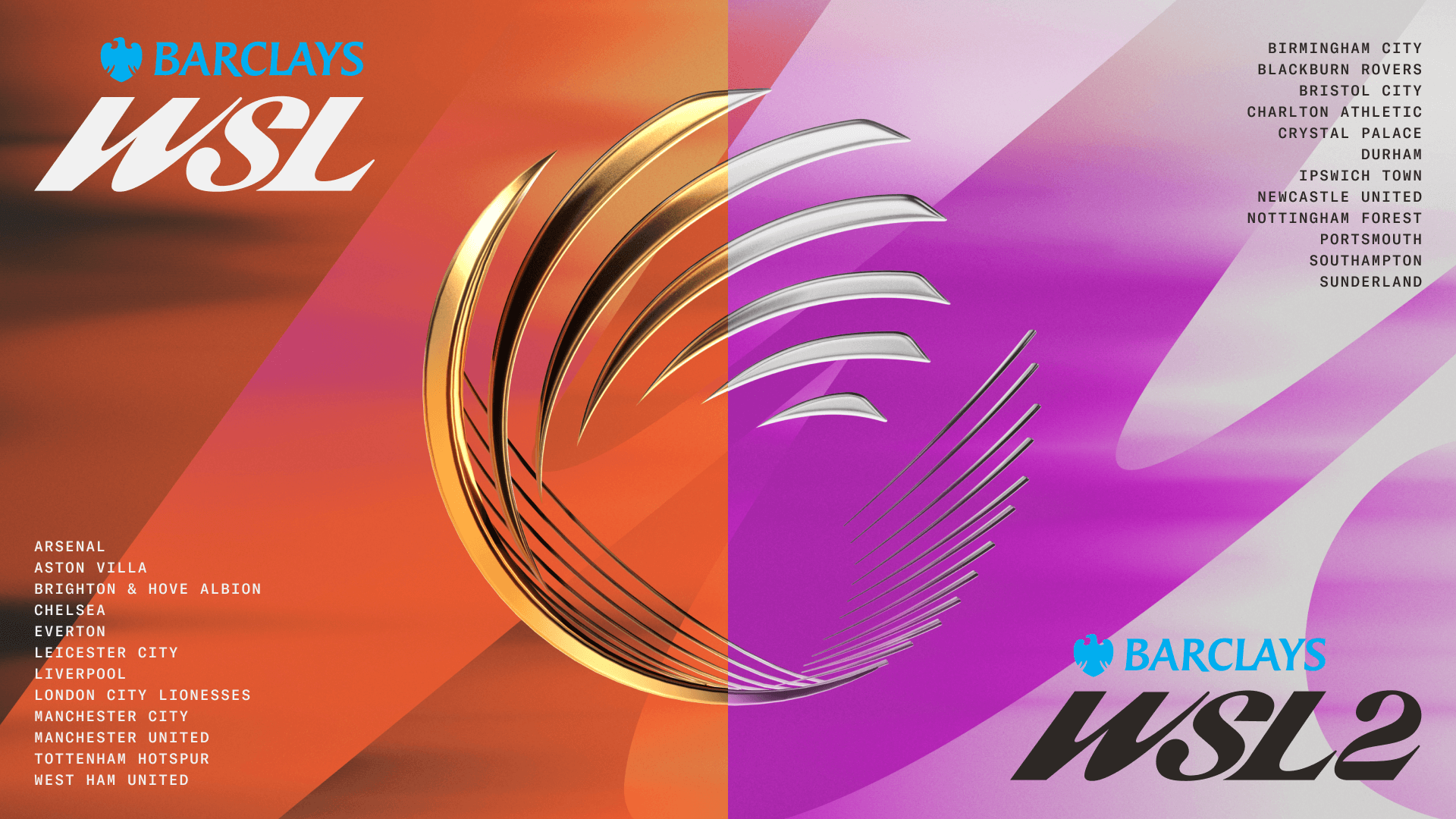

The Women’s Super League (WSL), the top level of women’s football in England, has revealed a rebrand for the 2025-26 season.
The move sees the second-tier Women’s Championship renamed as WSL2, bringing both leagues under the same umbrella.
The Women’s Professional Leagues Limited (WPLL), the independent body that oversees both leagues, has also rebranded to Women’s Super League Football (WSL Football).
The WPLL assumed ownership of the top two tiers from the Football Association (FA) ahead of the 2024-25 campaign.
New logos and colour systems for each league were unveiled on Monday as part of a “new visual identity,” which will be seen on team kits and on footballs as well as in stadiums as part of the matchday experience.
A new WSL Football website will also be launched this summer.
“No one plays football like a female — it is our strength and the way players move is one element of what makes women’s football distinctive and special,” said WSL Football chief marketing officer Ruth Hooper.
Advertisement
“It has taken months of work, and we have spoken to clubs, fans, players and partners who have all inputted during the process and been on this journey with us.
“There is a lot more in store over the coming months as we continue to grow the women’s game for the future.”
What does the rebrand mean for women’s football?
Analysis from women’s football writer Megan Feringa
What is being announced isn’t necessarily groundbreaking. The prospect of the Women’s Championship being rebranded to the WSL2 was highly anticipated, as was the Women’s Professional League Limited formally changing its name to encompass the WSL brand, which is only probably going to be confusing for the next 12 months, minimum, probably.
What is surprising from this is the badge. Initial reaction: Why is everything so aggressively slanted, as if the word WSL is tumbling down a mountainside in high heels? There’s forward, progressive movement and then there’s this. The logo is eye-catching and slick and sure, kind of cool, yet how it will be readily identifiable as a women’s football’s emblem to those outside the game begs questions. That a global women’s surfing league (WSL) shares the same initials as the WSL comes to mind when considering the new badge. Another question: How easily can it be replicated onto merchandise and playing shirts? Will this be an unnecessary cost for teams already working within restricted budget ranges?
The WPLL (now WSL Football) deserves acknowledgement for attempting to think outside the box, even redesigning the box. But sometimes it’s important to remember football is about football. Women’s football in England is at a crossroads, the most recent season’s anaemic final weekend a reminder that it needs a fundamental revamp to move it forward. A heavily slanted logo only goes so far.
(Photos: WSL)
This news was originally published on this post .


About the author

Český tenisový svaz žaluje bývalého předsedu o více než milion korun
Online magazín deníku Právo & Seznam.czCopyright © 1996–2025, Seznam.cz, a.s., Borgis, a.s., ČTK, DPA, Reuters, fotobanka Profimedia.Publikování nebo další šíření obsahu serveru Sport.cz je bez písemného souhlasu společnosti Borgis, a.s. zakázáno. RSS kanály serveru Sport.cz jsou určeny pouze pro osobní užití. Jakékoli kopírování, šíření nebo využívání obsahu RSS kanálů serveru Sport.cz bez předchozího písemného souhlasu společnosti Borgis a.s. není dovoleno. Dodavatelem obsahu serveru Sport.cz a osobou vykonávající redakční odpovědnost je společnost BORGIS a.s. Šiřitelem reklamy na serveru Sport.cz je společnost Seznam.cz, a.s., IČO 26168685.
Ztráta pro Leverkusen. Frimpong má údajně namířeno do Liverpoolu
Kicker uvedl, že jednání dospěla do fáze před podpisem. Frimpong, spoluhráč útočníka Patrika Schicka a brankáře Matěje Kováře, má v německém klubu smlouvu až do roku 2028, ale je v ní klauzule o možném předčasném odchodu v případě nabídky ve výši alespoň 40 milionů eur (téměř miliarda korun).Frimpong působí v Leverkusenu od příchodu ze Celticu Glasgow v roce 2021. Za Bayer od té doby odehrál 190 soutěžních zápasů a vstřelil 30 gólů. V minulé sezoně s ním dvanáctinásobný reprezentant vyhrál ligu i Německý pohár. Jeho odchod by znamenal další velkou ztrátu pro tým letošního vicemistra po pilíři obrany Jonathanu Tahovi. Nejistá je také budoucnost ofenzivního záložníka Floriana Wirtze a spekuluje se i o Schickovi. Trenérský post po sezoně opustí Xabi Alonso.

McGregor is still obsessed with being above Floyd Mayweather: his latest attack through an image
It has been almost eight years since Floyd Mayweather Jr. and Conor McGregor faced each other at the T-Mobile Arena in Las Vegas, but the rivalry between them is still as active as ever, at least on social media. This weekend, the Irish fighter once again provoked Mayweather with a post on Instagram, in which he made it clear that his obsession with surpassing the American boxer remains intact.The fight between the two, held in August 2017, was one of the most high-profile in recent history. Mayweather, with his technical and unbeatable style, won by technical knockout in the 10th round, to sign his 50th victory and close his professional career with a perfect record. Since then, he has limited himself to exhibition fights, facing opponents such as Tenshin Nasukawa, Logan Paul and Mikuru Asakura.McGregor, meanwhile, has not competed since […]
Další rána pro Slováky. MS opouští kvůli zlomené ruce liberecký zadák
Slováky čeká další zápas ve středu proti Francii. Ve skupině A jsou zatím se čtyřmi body na čtvrtém místě. S Rakouskem prohráli 2:3 po samostatných nájezdech po sporném momentu, kdy Michala Krištofa v páté sérii při snaze o vyrovnání stavu fauloval gólman David Kickert.MS v hokeji 202588. ročník mistrovství světa v hokeji je na programu v termínu od 9. do 25. května 2025. Hostí jej Švédsko a Dánsko, konkrétně města Stockholm a Herning.
Reprezentace má naordinované volno. Rulík a spol. plánují vyrazit na kola
Herning (Od našeho zpravodaje) - Mají teď na šampionátu dva volné dny, pak navíc následují zápasy s Maďarskem a Kazachstánem, i proto si čeští hokejisté mohou po dvou náročných duelech s Norskem a Dánskem dovolit tréninkový oddech. „Je to fajn. Ve středu pak potrénujeme, třeba přesilovky,“ říkal útočník Martin Nečas.Tým nemá naplánovaný žádný společný program ani výlet, jak občas na šampionátech bývá zvykem. Jen trenéři uvažovali, že vyrazí společně na kolech. To je v Herningu jejich oblíbená kratochvíle, protože z hotelu v centru města do arény jezdí díky dobrým cyklostezkám na kole každý den dvakrát. Jsou to necelé tři kilometry. „Sice to není dohromady ani hodinka (dvakrát cesta tam a zpět), ale aspoň něco,“ říká Rulík.To připomíná Tampere před třemi lety, kde Jalonenovi pobočníci často využívali k přesunu elektrických koloběžek.Zároveň ale Rulík a spol. musí během volných dní vyřešit, jak postupovat ohledně soupisky. Šampionát kvůli zranění skončil pro útočníka Jáchyma Kondelíka, […]

Zinho rebate Zubeldía após Palmeiras x SPFC no Brasileirão: “Não teve”
Zubeldía durante Palmeiras x SPFC - Divulgação Zinho reprovou a entrevista de Luis Zubeldía após a derrota do São Paulo por 1 a 0 para o Palmeiras, domingo, pela oitava rodada do Brasileirão. Durante o programa Equipe F, da ESPN, o tetra contestou o argentino que mencionou o gramado sintético como um dificultador para a equipe. Na coletiva, o argentino não contestou o triunfo do Verdão, mas admitiu que o rival está muito mais habituado ao campo de jogo. PUBLICIDADE PUBLICIDADE “Tem diferença sim, o Palmeiras está mais acostumado. Agora, os outros seis empates do São Paulo neste campeonato não foram no sintético. Contra o Palmeiras, ele pode dizer isso, mas os seis jogos, inclusive no Morumbi. Então, é um desempenho ruim”, disse Zinho. Com o primeiro revés na competição, o Tricolor permanece com nove pontos e caiu para o […]
Related
Český tenisový svaz žaluje bývalého předsedu o více než milion korun
Online magazín deníku Právo & Seznam.czCopyright © 1996–2025, Seznam.cz, a.s., Borgis, a.s., ČTK, DPA, Reuters, fotobanka Profimedia.Publikování nebo další šíření obsahu serveru Sport.cz je bez písemného souhlasu společnosti Borgis, a.s. zakázáno. RSS kanály serveru Sport.cz jsou určeny pouze pro osobní užití. Jakékoli kopírování, šíření nebo využívání obsahu RSS kanálů serveru Sport.cz bez předchozího písemného souhlasu společnosti Borgis a.s. není dovoleno. Dodavatelem obsahu serveru Sport.cz a osobou vykonávající redakční odpovědnost je společnost BORGIS a.s. Šiřitelem reklamy na serveru Sport.cz je společnost Seznam.cz, a.s., IČO 26168685.
Ztráta pro Leverkusen. Frimpong má údajně namířeno do Liverpoolu
Kicker uvedl, že jednání dospěla do fáze před podpisem. Frimpong, spoluhráč útočníka Patrika Schicka a brankáře Matěje Kováře, má v německém klubu smlouvu až do roku 2028, ale je v ní klauzule o možném předčasném odchodu v případě nabídky ve výši alespoň 40 milionů eur (téměř miliarda korun).Frimpong působí v Leverkusenu od příchodu ze Celticu Glasgow v roce 2021. Za Bayer od té doby odehrál 190 soutěžních zápasů a vstřelil 30 gólů. V minulé sezoně s ním dvanáctinásobný reprezentant vyhrál ligu i Německý pohár. Jeho odchod by znamenal další velkou ztrátu pro tým letošního vicemistra po pilíři obrany Jonathanu Tahovi. Nejistá je také budoucnost ofenzivního záložníka Floriana Wirtze a spekuluje se i o Schickovi. Trenérský post po sezoně opustí Xabi Alonso.
McGregor is still obsessed with being above Floyd Mayweather: his latest attack through an image
It has been almost eight years since Floyd Mayweather Jr. and Conor McGregor faced each other at the T-Mobile Arena in Las Vegas, but the rivalry between them is still as active as ever, at least on social media. This weekend, the Irish fighter once again provoked Mayweather with a post on Instagram, in which he made it clear that his obsession with surpassing the American boxer remains intact.The fight between the two, held in August 2017, was one of the most high-profile in recent history. Mayweather, with his technical and unbeatable style, won by technical knockout in the 10th round, to sign his 50th victory and close his professional career with a perfect record. Since then, he has limited himself to exhibition fights, facing opponents such as Tenshin Nasukawa, Logan Paul and Mikuru Asakura.McGregor, meanwhile, has not competed since […]
Další rána pro Slováky. MS opouští kvůli zlomené ruce liberecký zadák
Slováky čeká další zápas ve středu proti Francii. Ve skupině A jsou zatím se čtyřmi body na čtvrtém místě. S Rakouskem prohráli 2:3 po samostatných nájezdech po sporném momentu, kdy Michala Krištofa v páté sérii při snaze o vyrovnání stavu fauloval gólman David Kickert.MS v hokeji 202588. ročník mistrovství světa v hokeji je na programu v termínu od 9. do 25. května 2025. Hostí jej Švédsko a Dánsko, konkrétně města Stockholm a Herning.
Reprezentace má naordinované volno. Rulík a spol. plánují vyrazit na kola
Herning (Od našeho zpravodaje) - Mají teď na šampionátu dva volné dny, pak navíc následují zápasy s Maďarskem a Kazachstánem, i proto si čeští hokejisté mohou po dvou náročných duelech s Norskem a Dánskem dovolit tréninkový oddech. „Je to fajn. Ve středu pak potrénujeme, třeba přesilovky,“ říkal útočník Martin Nečas.Tým nemá naplánovaný žádný společný program ani výlet, jak občas na šampionátech bývá zvykem. Jen trenéři uvažovali, že vyrazí společně na kolech. To je v Herningu jejich oblíbená kratochvíle, protože z hotelu v centru města do arény jezdí díky dobrým cyklostezkám na kole každý den dvakrát. Jsou to necelé tři kilometry. „Sice to není dohromady ani hodinka (dvakrát cesta tam a zpět), ale aspoň něco,“ říká Rulík.To připomíná Tampere před třemi lety, kde Jalonenovi pobočníci často využívali k přesunu elektrických koloběžek.Zároveň ale Rulík a spol. musí během volných dní vyřešit, jak postupovat ohledně soupisky. Šampionát kvůli zranění skončil pro útočníka Jáchyma Kondelíka, […]
Zinho rebate Zubeldía após Palmeiras x SPFC no Brasileirão: “Não teve”
Zubeldía durante Palmeiras x SPFC - Divulgação Zinho reprovou a entrevista de Luis Zubeldía após a derrota do São Paulo por 1 a 0 para o Palmeiras, domingo, pela oitava rodada do Brasileirão. Durante o programa Equipe F, da ESPN, o tetra contestou o argentino que mencionou o gramado sintético como um dificultador para a equipe. Na coletiva, o argentino não contestou o triunfo do Verdão, mas admitiu que o rival está muito mais habituado ao campo de jogo. PUBLICIDADE PUBLICIDADE “Tem diferença sim, o Palmeiras está mais acostumado. Agora, os outros seis empates do São Paulo neste campeonato não foram no sintético. Contra o Palmeiras, ele pode dizer isso, mas os seis jogos, inclusive no Morumbi. Então, é um desempenho ruim”, disse Zinho. Com o primeiro revés na competição, o Tricolor permanece com nove pontos e caiu para o […]
Be the first to leave a comment